Picture & CherryPah
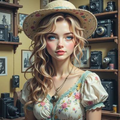 Picture
Привет, Вишенка, ты когда-нибудь задумывалась, как приглушенные тона старых фильмов контрастируют с яркими всплесками цвета в твоих картинах? Мне бы очень хотелось узнать, что ты об этом думаешь, как это всё сочетается.
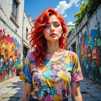 CherryPah
I love that idea – old film’s muted grays and sepias feel like a quiet, honest whisper, while my splashes of neon are a shout. When I layer them, I start with a faded canvas, let the past breathe, then punch in bold shapes that clash and dance with the nostalgia. It’s like saying, “Let’s remember softly, but celebrate loudly.” It gives the piece depth and a story that jumps out at you. Try painting the film tones in watercolor first, then drape a bright acrylic halo over it – the contrast makes each color pop, but the muted base keeps it grounded. It’s a little rebellion, but also a nod to history.